
1. The Burger King (Burger King)
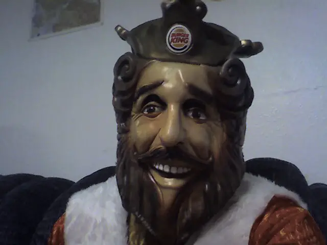
The Burger King mascot has undergone several transformations over the years, but there was one version that had people genuinely questioning their dinner choices. The King, originally portrayed as a big-headed man in a suit, was unnervingly lifelike. His blank stare, paired with his odd behavior in commercials, made him seem more like a villain from a B-horror film than a fast food spokesperson. His awkwardly posed interactions with people, often too close for comfort, led to widespread discomfort.
In 2011, Burger King decided to retire this King version after fans and critics alike expressed unease. The mascot was replaced by a more approachable, friendly representation of the brand. But for a while, that lifeless, plastic look lingered in the minds of anyone who saw those bizarre commercials. It seems that not even the fast food industry is immune to the power of the uncanny valley.
2. Charlie the Tuna (StarKist)
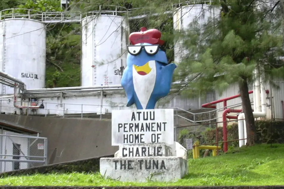
Charlie the Tuna has been the face of StarKist for decades, but in the ‘70s, his unsettling portrayal as a cool, but somewhat smug, fish raised more than a few eyebrows. While intended to be playful and humorous, the exaggerated features and voice of Charlie made him look like he belonged in a different era. With his anthropomorphic smile and human-like actions, Charlie seemed to cross that line between cute and creepy.
While he didn’t fully disappear, his presence was reduced significantly after the 1980s. A more modern redesign in the ‘90s softened Charlie’s look, making him less jarring. Still, the image of a walking, talking fish who thinks he’s a big shot remains an eerie relic of fast food marketing from the past.
3. The Taco Bell Chihuahua (Taco Bell)
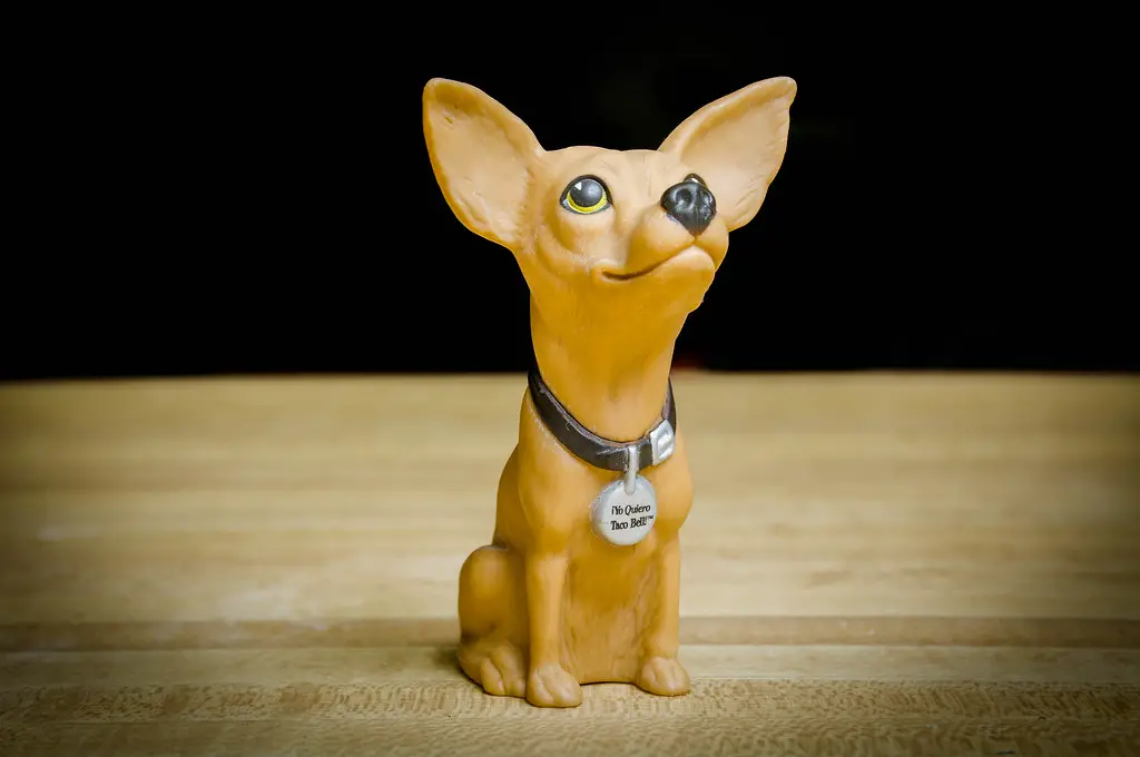
“Yo quiero Taco Bell!” That infamous catchphrase, delivered by the Taco Bell Chihuahua, became a cultural moment in the ‘90s. But despite his popularity, there was something unsettling about the tiny dog, especially with his human-like speech patterns. His exaggerated expressions, paired with the fact that he was a dog attempting to act like a human, made him feel just a little too close to the uncanny valley.
In 2000, Taco Bell decided to retire the Chihuahua after some controversy, including complaints from dog lovers about how the character might encourage negative stereotypes. The decision was also influenced by a shift in the company’s marketing strategy. While some fans were sad to see him go, others were relieved, as the Chihuahua’s awkward antics were better suited to a time when such offbeat humor was more accepted.
4. Aunt Jemima (now the Pearl Milling Company)
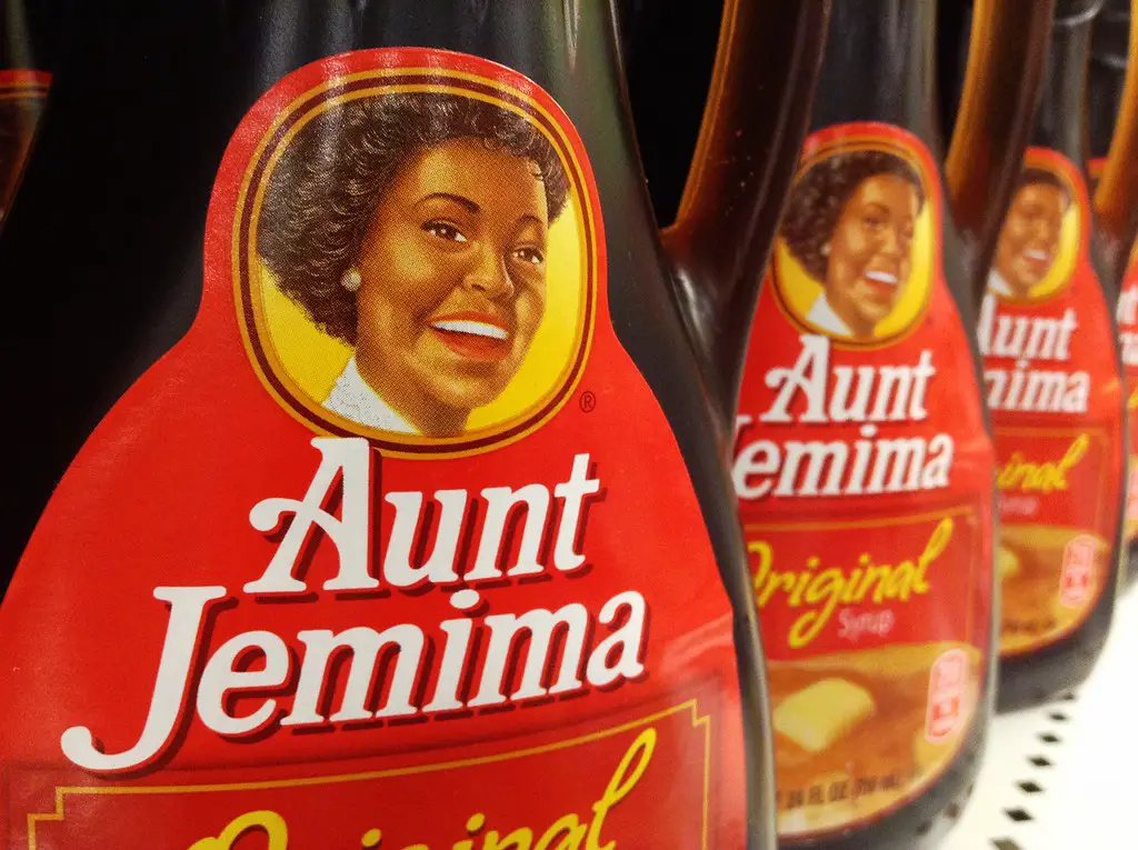
Aunt Jemima, now known as Pearl Milling Company, was the face of syrup and pancake mixes for over a century. The mascot, with her exaggerated, stereotypical image of an African American woman, has long been a subject of controversy. Her wide, toothy grin and upbeat demeanor, while meant to be welcoming, also became a symbol of racial caricature.
Following the rise of the Black Lives Matter movement and increased awareness about racial sensitivity, the brand decided to retire the Aunt Jemima persona in 2020. The change reflected a broader shift toward more inclusive marketing. For many, the image of Aunt Jemima was a reminder of how far the food industry had come in terms of rethinking offensive depictions.
5. The Keebler Elves (Keebler)
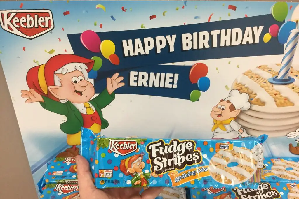
The Keebler Elves have been around for decades, tirelessly baking cookies in their little treehouse. While they started as a quirky, fun brand mascot, the original 1960s versions of the elves were far creepier than the cuddly versions we know today. Their overly expressive faces, disproportionate features, and high-pitched voices had a distinctly unnerving quality.
While the Keebler Elves still remain a recognizable part of the brand, their early appearances were much darker and more unsettling. Over the years, their image has been softened, turning them into the friendly, jovial bakers we see now. But there was a time when the idea of tiny elves living in a tree and baking cookies might have been a bit too weird for comfort.
6. The Michelin Man (Michelin Tires)
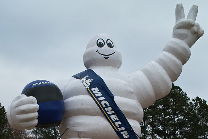
The Michelin Man, or “Bibendum,” has been a symbol for Michelin Tires for over a century. Though he’s beloved by many, his appearance in the early days was rather eerie. With his stacked, bulbous body made of tires, Bibendum’s human-like face peering out from between the rubber layers often gave off a strange vibe. His unsettling proportions and surreal design made him feel less like a friendly mascot and more like a strange tire-based entity.
Over time, the Michelin Man has evolved into a much friendlier, more relatable figure. However, his original look still remains one of the most unnerving mascots in advertising history. The Michelin Man’s transformation into a more approachable character was undoubtedly necessary, as his initial appearance sparked more confusion than confidence in the brand.
7. The Gerber Baby (Gerber)
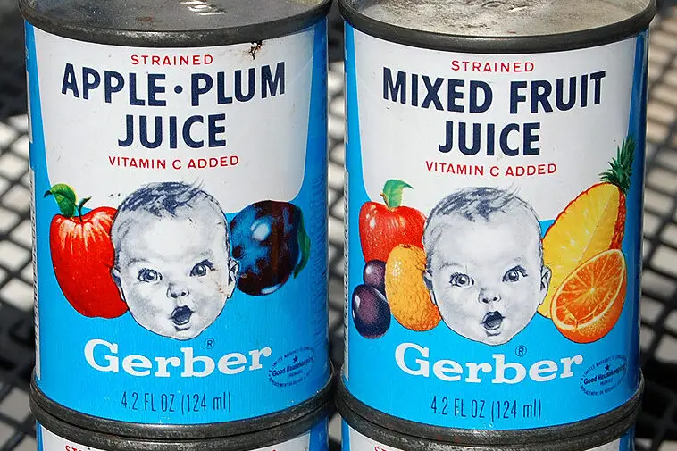
While the Gerber Baby is one of the most iconic faces in advertising, its origins are a little bit creepier than most people realize. The original baby, who became the face of the Gerber brand in the 1930s, was a real baby named Ann Turner Cook. Her portrait, with its wide eyes and solemn expression, might not seem so disturbing now, but back then, the unblinking stare was a bit unnerving.
Over time, the company kept the Gerber Baby brand alive, but as societal attitudes towards babies in advertising shifted, the image became increasingly stylized and less lifelike. Today, the brand’s use of a more abstract logo still evokes warmth and trust, but the original, slightly eerie baby face remains a reminder of a simpler, though somewhat unsettling, time.
8. The Jolly Green Giant (Green Giant)
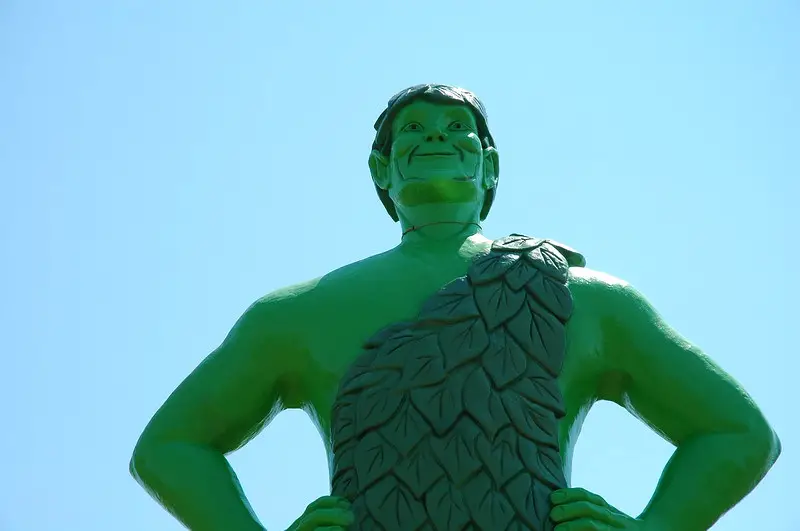
The Jolly Green Giant has been around for years, and while he’s meant to represent the freshness of vegetables, his towering figure can be a bit unnerving. In his early years, the Giant wasn’t as friendly-looking as the jolly figure we know today. His size, paired with his deep voice and solemn expression, made him appear more like a looming figure than a friendly mascot.
Through the years, his character evolved, and today he’s often portrayed with a friendlier, more approachable smile. However, the original version of the Jolly Green Giant left a lasting impression as one of the more creepy food mascots. His giant, stoic form was just a little too imposing for comfort.
9. The Hamburglar (McDonald’s)

The Hamburglar has been a beloved figure in the McDonald’s family of characters, but there was a time when his antics felt more sinister than fun. The original Hamburglar, who wore a black-and-white striped suit and had a mischievous grin, often felt more like a criminal than a fun character. His constant attempts to steal hamburgers made him seem less like an innocent rascal and more like a shady figure out for trouble.
While the character was revamped over the years to appear more cartoonish and goofy, the early Hamburglar’s creepy aura couldn’t be ignored. His transformation into a more child-friendly character helped McDonald’s distance itself from the idea that it was endorsing criminal behavior, even if it was just in a playful way.
10. The Kool-Aid Man (Kool-Aid)
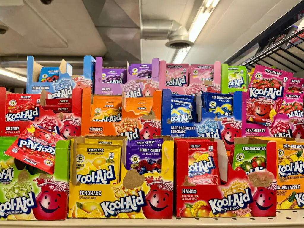
The Kool-Aid Man, with his giant, anthropomorphic pitcher body, is one of the most memorable fast food mascots. But in his early days, there was something a bit unsettling about the way he burst through walls, shouting “Oh yeah!” His eyes, though wide, had an almost vacant look that made him appear too surreal for comfort.
Over time, the Kool-Aid Man became more playful and fun, shifting from a menacing figure to a friendly, boisterous character. His bizarre ability to crash through walls was reinterpreted as a more humorous element, but it still carries that initial strangeness. Today, the Kool-Aid Man is a beloved figure, but his early, somewhat unsettling presence still lingers in the memories of many.
11. The Pringles Guy (Pringles)
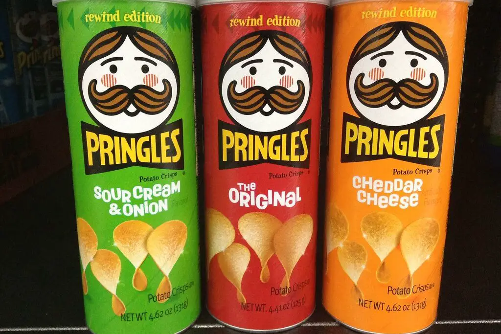
The Pringles Guy, with his iconic mustache and monocle, may seem like an unlikely creepy mascot, but there’s something unsettling about his immobile face. His expression, frozen in time, feels more like a mask than a real person. The fact that he’s just a face, with no body attached, made him look more like a disembodied head rather than a friendly mascot.
While Pringles has made changes over the years to make their branding more modern, the original Pringles Guy still seems to haunt some fans. His facial expression, which was always the same, didn’t convey the warmth or joy you’d expect from a food mascot. Instead, he came off as a stiff, strange figure in a commercial landscape filled with more animated, expressive characters.
12. The Pizza Hut “The Big Pizza Head” (Pizza Hut)
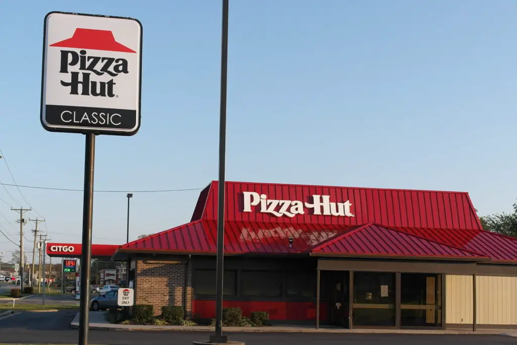
In the late ’80s, Pizza Hut introduced a mascot known as “The Big Pizza Head,” a massive, animated pizza slice with eyes and a mouth. While the concept was meant to be fun and playful, the character’s oversized features and bizarre movements left many customers feeling uneasy. The pizza slice’s facial expressions were exaggerated, and its appearance was unsettlingly close to something out of a horror movie, especially when it started talking.
This bizarre character was part of a campaign that didn’t quite resonate with the public. The “Big Pizza Head” quickly fell into obscurity after its brief stint as the face of Pizza Hut, as it was replaced by friendlier, more traditional mascots. The unsettling nature of the mascot still lingers in the memories of anyone who remembers the oddity of a talking pizza slice with human features.