
1. Friends – Monica’s Apartment
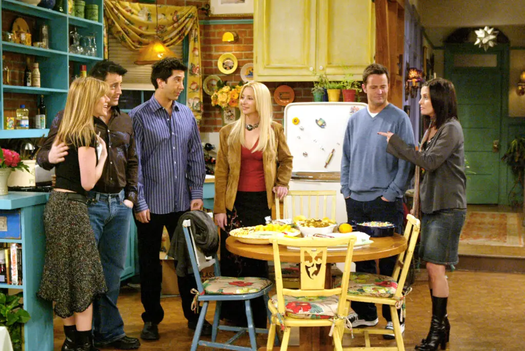
Monica’s apartment in Friends is iconic, but the layout is nothing short of puzzling. For one, the fact that two apartments, each with an entire living room, kitchen, and bathroom, could exist on a single floor in New York City seems too good to be true. It’s especially odd given the building’s exterior, which clearly only has a few floors. If you’re trying to picture how all the rooms fit, you might end up scratching your head as the set designers clearly favored aesthetics over realism shares Architectural Digest.
Then, consider the apartment’s features. Monica’s apartment has a full-size kitchen and even a fireplace, which doesn’t make sense given the limited space shown in the hallways. If you compare that to the actual floor plans of the building used for filming, there’s no way both apartments could comfortably exist on the same floor without significant changes to the building’s architecture adds SlashFilm.
2. The Big Bang Theory – Leonard and Sheldon’s Apartment
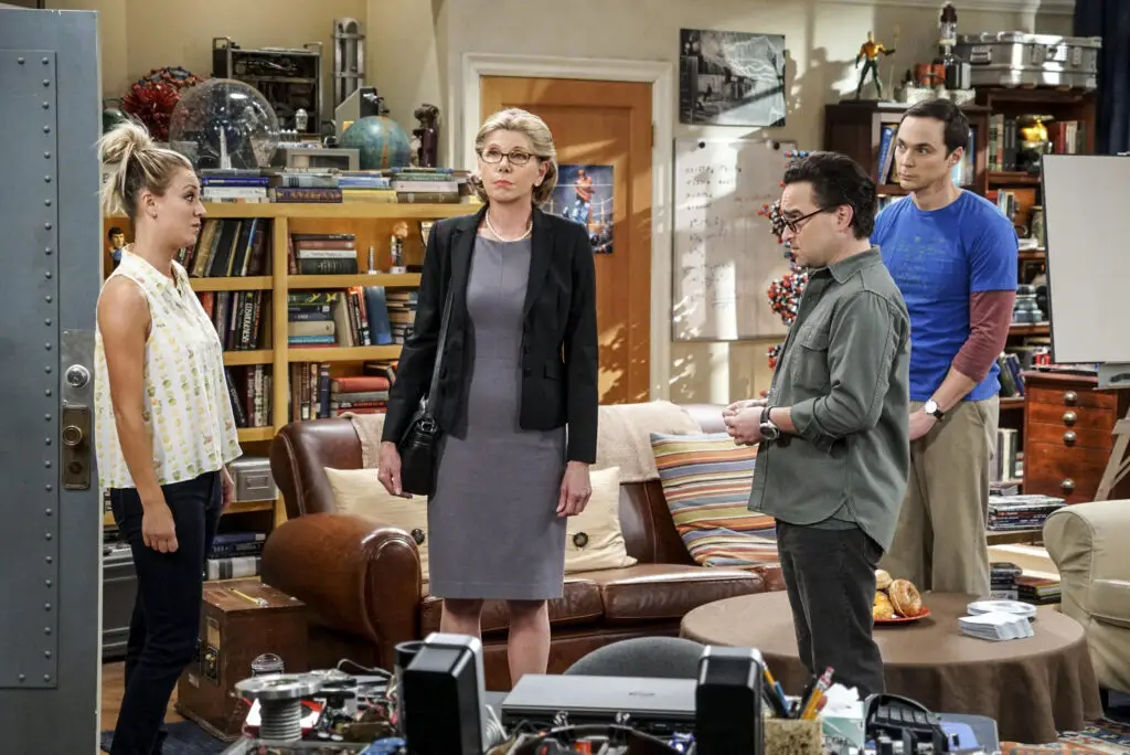
Leonard and Sheldon’s apartment is another one that doesn’t quite add up. The apartment, located on a floor in a high-rise building, includes an expansive living room, kitchen, and large windows overlooking a breathtaking view of Pasadena. The issue here is how massive their apartment appears compared to the surrounding buildings and their supposed income says Screen Rant.
If you take a closer look at the supposed layout, it becomes clear that the space is way too big for two physicists living on modest salaries. The floorplan seems to suggest a more luxurious apartment than the characters could realistically afford, even when you factor in Sheldon’s eccentricity and Leonard’s regular academic paycheck adds BuzzFeed.
3. Full House – The Tanner Family House
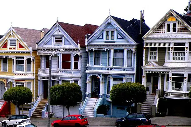
The Tanner family home in Full House had the perfect combination of homey charm and quirky features, but it was hardly practical. The living room had a large bay window overlooking a hill, but a few things just don’t add up when you consider the floorplan. For instance, the upstairs and downstairs didn’t seem to align correctly in terms of their exterior views.
The biggest issue, however, is the seemingly infinite number of bedrooms in a house that’s supposed to be a modest San Francisco home. The family, consisting of three adults and three kids, would have required an absurd amount of space to be comfortable. In reality, a house like that would likely need to be much larger than it appeared.
4. The Simpsons – The Simpson Family Home
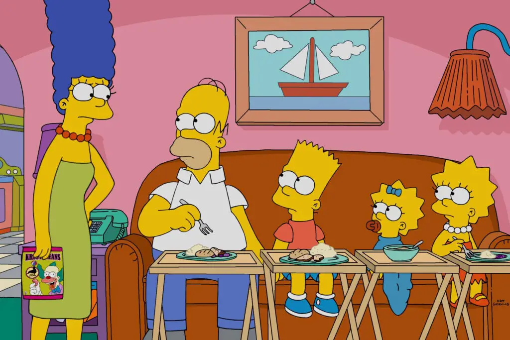
The Simpson house, while cartoonishly charming, is more confusing than it seems at first glance. The most confusing part is the size of the house compared to the number of family members. Despite having four main characters, the house always appeared to have more space than they would realistically need, especially for a working-class family.
Furthermore, there’s the issue of how the rooms didn’t seem to align with each other. For example, you can never quite figure out how Bart’s room, the living room, and the kitchen connect. This leads you to wonder how the layout could possibly work without stretching the physical laws of space.
5. That ’70s Show – The Formans’ Basement
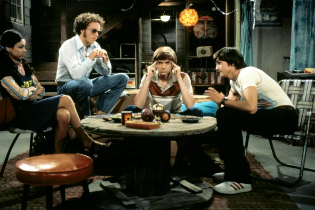
The Formans’ basement in That ’70s Show served as a key hangout spot for the kids, but the layout has always been puzzling. On one hand, it’s clear that it’s meant to be a cozy, secluded spot for the teens, but the size and shape of the space don’t quite add up. The area is vast enough to fit a full-size couch, a TV, a record player, and even a game table, yet the house doesn’t appear to be that big in real life.
If you think about the house’s exterior and where the basement should be, it just doesn’t make sense that the basement is as big as it appears. You’d expect a basement this size to be in a much larger home than the Formans’ modest suburban house.
6. Bewitched – The Stephens’ House
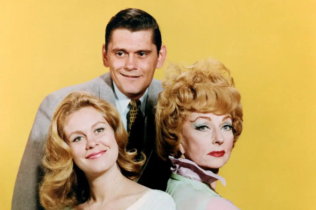
The Stephens’ house in Bewitched was always an endearing setting for Samantha and Darrin’s wacky adventures, but when you look at the layout, it’s a little confusing. While the house looks charming from the outside, its floorplan doesn’t match up with how the rooms appear on screen. The house always seemed to have multiple levels and rooms that would be hard to fit into such a small space.
One of the most noticeable oddities is how the house’s entrance and layout often changed between episodes. Sometimes there would be stairs leading to a second floor, and other times, it would seem as if the kitchen was on the same level as the living room, which makes no sense in terms of the house’s supposed structure.
7. The Golden Girls – The House in Miami
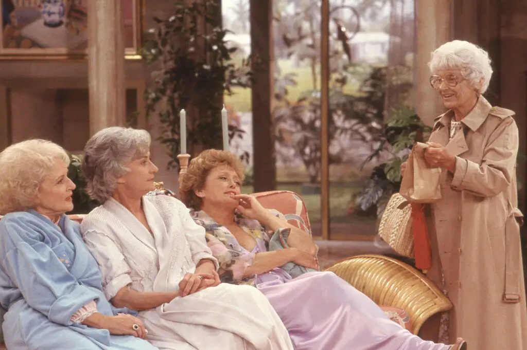
The house that the Golden Girls shared in Miami was meant to be an affordable option for four retired women, but it’s harder to justify the reality of that floorplan. The house itself is huge for a Florida condo, with multiple bedrooms, a spacious living room, and plenty of space for hosting parties and events. Given their respective financial situations, it would have been improbable for them to afford this place without some form of magic.
Then, there’s the mystery of how the house’s exterior never quite matches the interior shots. The backyard seems far too big, and the front of the house doesn’t align with the floor plan shown inside. It’s another case where convenience and style trumps any kind of architectural accuracy.
8. The Brady Bunch – The Brady Family Home
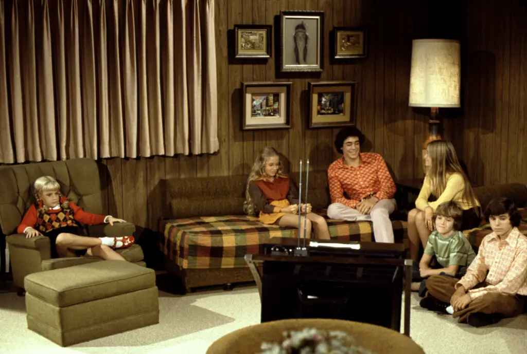
The Brady family home in The Brady Bunch had that classic 1970s charm, but its floorplan left much to be desired. The house had a large living room, a staircase leading up to the kids’ rooms, and a kitchen with a sizable dining area. However, when you consider the actual layout, it’s hard to figure out how all the rooms fit together.
For instance, there’s the issue of the number of bedrooms. In the floor plan, the parents’ bedroom doesn’t seem large enough to accommodate their family, which always seemed somewhat strange. Add to that the huge living room space, which would likely be unnecessary in a family home.
9. How I Met Your Mother – Ted’s Apartment
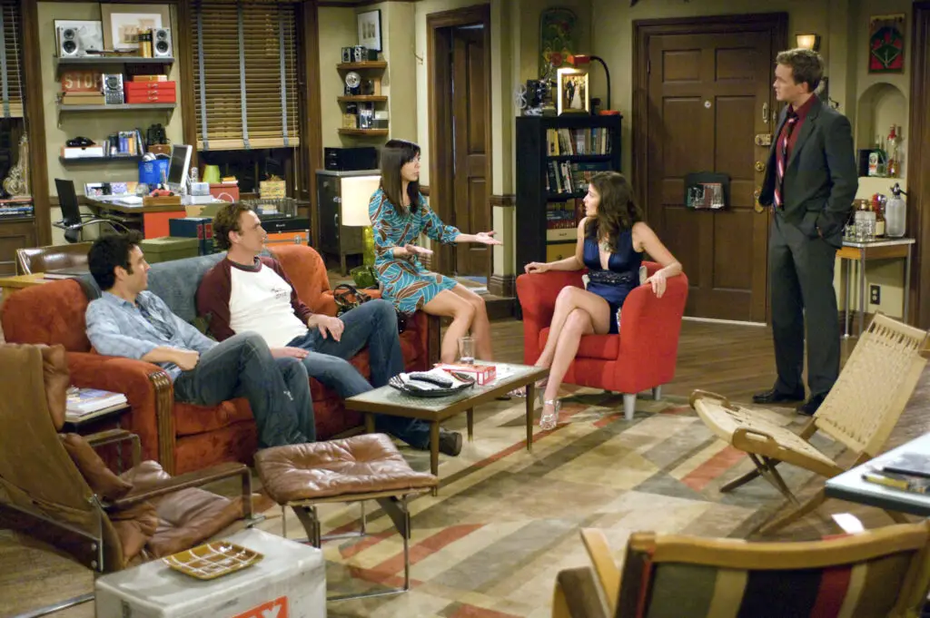
Ted Mosby’s apartment in How I Met Your Mother is another sitcom house that doesn’t quite make sense when you break it down. On the outside, it looks like a typical New York apartment, but the layout of the space is perplexing. For one, it’s surprisingly large for a man living alone, and it seems to have way too many rooms compared to the building’s exterior.
Moreover, the fact that his apartment has a huge balcony, a rooftop, and plenty of floor space doesn’t match up with the typical rents of New York’s Upper West Side, especially for someone like Ted, who is just starting out as an architect. The whole thing seems like an unrealistic representation of an actual New York City apartment.
10. Married with Children – The Bundy House
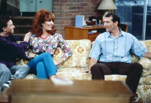
The Bundy house from Married with Children was a rather nondescript home that fit the dysfunctional family perfectly. But once you start analyzing the floorplan, things become unclear. The Bundys’ living room is large enough to fit a sofa, a chair, and a TV, but when you consider the number of bedrooms, it’s hard to figure out where they would all fit. The exterior shots of the house show a small structure, but inside, it appears much larger.
Add to that the fact that the house never seemed to have a garage or a clear backyard, and it’s easy to see how this sitcom house could be challenging to map out in reality. The floors don’t align with the spaces seen through the windows, making you wonder how much of it was simply for comedic effect.
11. The Nanny – The Fine House

The mansion owned by Mr. Sheffield in The Nanny was another iconic sitcom house, but its floorplan made little sense. For one, the house had vast spaces, including multiple levels and large rooms, yet we never saw the family do anything that would require that much space. It always felt as though the house was designed more for show than practicality.
What really throws things off is the relationship between the kitchen and dining areas. The kitchen seems far too small for a household that has a full-time live-in nanny, while the dining room is far too grand for the type of meals they’d typically serve. When considering the budget of the Sheffield family, it doesn’t add up that they could afford a house like that on their income.
12. The Office – Dunder Mifflin Scranton

Dunder Mifflin’s Scranton branch in The Office was meant to be an unassuming office building, but its interior layout has raised a few questions over the years. For one, the office floorplan itself doesn’t seem to correspond to the exterior of the building. The breakroom, the offices, and the bathroom were far too big for a small regional branch, and the open-concept style of the office just didn’t fit with what was shown from the outside.
Add to that the fact that Jim and Pam’s desks face each other in an unusual arrangement, and the layout seems downright odd for an office space of that type. You’d expect a lot more structure and division of space, which makes you wonder if the layout was more for comedy than practicality.