
1. The Color of Lucy’s Wardrobe in I Love Lucy
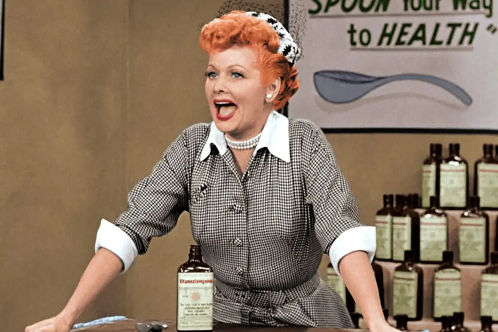
You might not have thought twice about Lucy Ricardo’s dresses, but the wardrobe choices were incredibly strategic. Since I Love Lucy was filmed in black and white, the costume designers used shades of blue, gray, and even brown instead of the red and pink hues we might expect for a fiery character like Lucy. That’s because those colors popped better on black-and-white film. Her clothes helped visually separate her from other characters, reinforcing her unique personality even without color shares Closer Weekly.
But it didn’t stop at fabric. Her wardrobe subtly evolved to reflect her journey from a housewife with showbiz dreams to a woman actually getting gigs. The color contrasts were paired with different textures, suggesting her emotional states. Even her iconic polka dots were a visual shorthand for whimsy and mischief. It was all far more deliberate than it looked on the surface adds the Lucy Lounge.
2. The Three Couch Cushions in The Brady Bunch
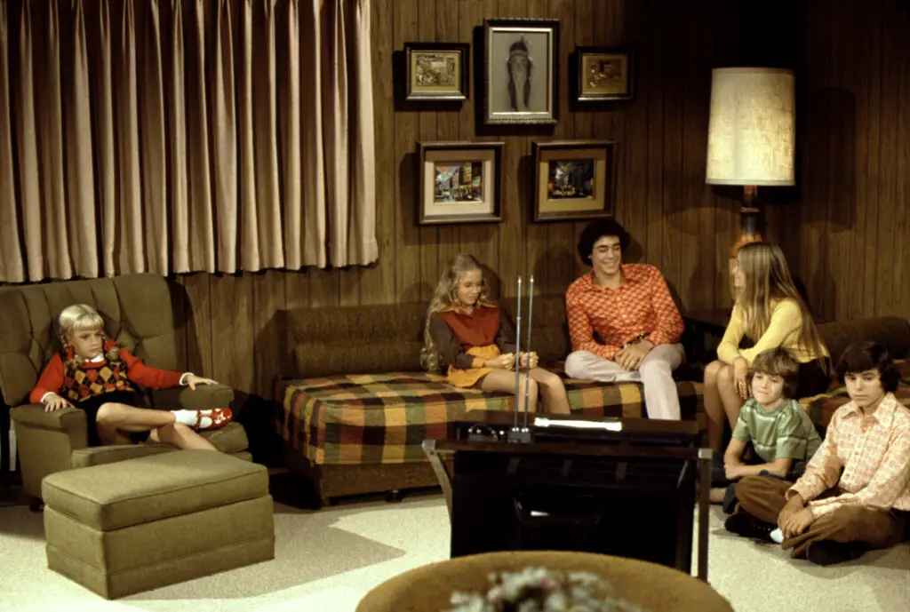
If you’ve ever watched The Brady Bunch, you might remember the family’s avocado green couch in the living room. But did you ever notice the three center cushions? They weren’t just a design choice. Each one symbolized a different group within the blended family: one for Mike’s kids, one for Carol’s, and the middle for unity says Biography.
It was a quiet reminder that while they were two separate families, they were coming together as one. The couch placement was also intentional in shots to show fairness—kids were never seated consistently on the same cushion, symbolizing balance. It might seem like just set dressing, but those little things helped reinforce the show’s themes of togetherness. You were subconsciously being told this family was learning to live, sit, and exist as one. That’s some clever set design.
3. Rob and Laura’s Twin Beds in The Dick Van Dyke Show
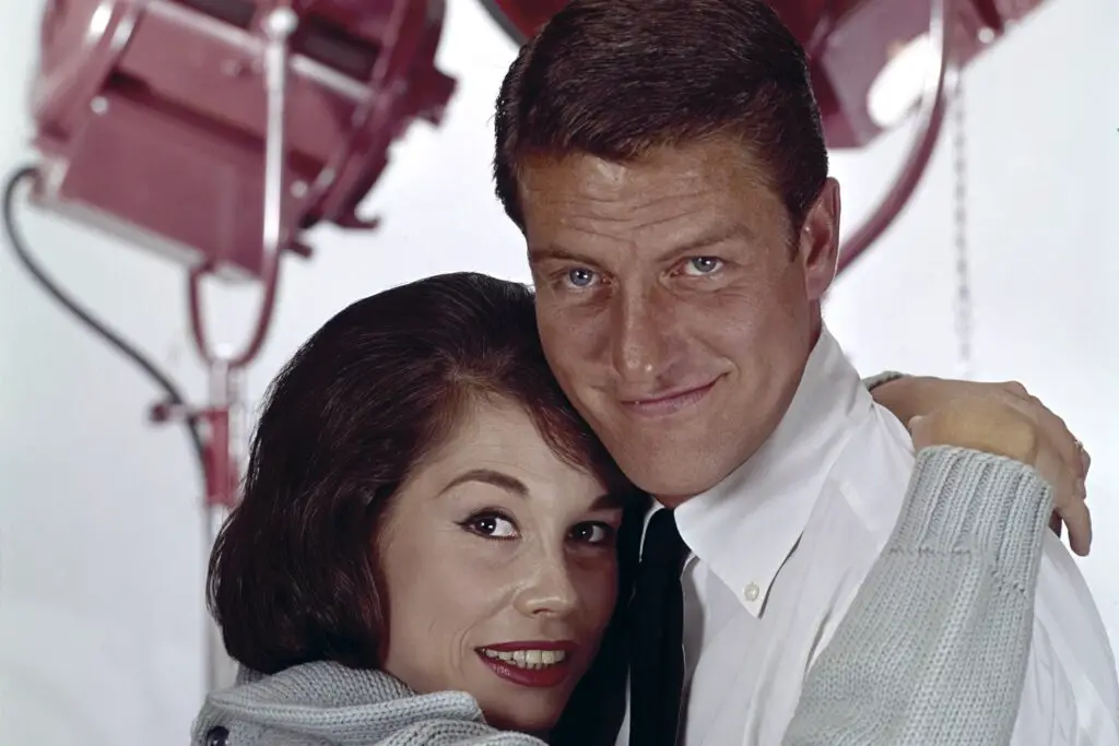
It’s easy to chalk up Rob and Laura Petrie’s twin beds to 1960s television censorship. But there’s actually more to it than just rules. Show creator Carl Reiner wanted their marriage to reflect the real, affectionate relationships he observed, not some idealized version. So the distance between the beds was shortened on purpose to make it feel more intimate than the usual sitcom setup says Showbiz Cheat Sheet.
That visual closeness subtly pushed back against the restrictions of the era. Rob and Laura were often shown leaning toward each other or sharing a blanket across the beds. That gave the audience a sense of romantic tension without breaking the censors’ rules. It was a small act of rebellion wrapped in goodnight kisses and pajama sets. And it worked—we all remember how charming their marriage felt.
4. The Fridge in Cheers
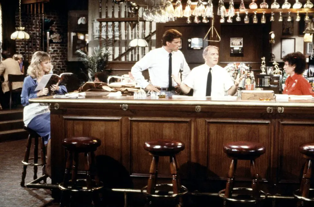
The bar in Cheers might be where everybody knows your name, but the fridge behind the bar holds a clever secret. Every time it opens, there’s a distinct clinking of bottles—but the camera never really shows what’s inside. That’s because the fridge wasn’t actually stocked. The sound effect was added post-production to create the illusion of a working bar.
It was also a metaphor, oddly enough. The fridge never being seen symbolized how the characters had rich inner lives we never quite accessed. What’s behind the bar, like what’s behind their jokes and bravado, is just out of reach. Norm’s home life, Cliff’s real job—lots of things were left implied. The fridge became a small symbol of all the things we’d never really know about them.
5. The Paintings in Frasier’s Apartment
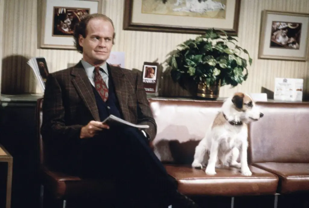
Frasier Crane had quite the apartment—modern, sleek, full of art you might not give a second glance. But those abstract paintings were chosen with care. The pieces were meant to reflect Frasier’s own inner conflict: cultured on the outside, chaotic on the inside. One particular piece behind the couch was purposely hung just slightly askew to reflect his discomfort with his personal life.
It was also a nod to his therapy background. Abstract art, much like Frasier’s clients, requires interpretation and reflection. The pieces weren’t just decoration—they mirrored the balance (or imbalance) of his highbrow taste and emotional messiness. If you were paying close attention, you’d notice that sometimes the paintings shifted positions between episodes. A hint that maybe Fras was trying to “fix” something that couldn’t be easily put straight.
6. Fonzie’s Bathroom Mirror in Happy Days
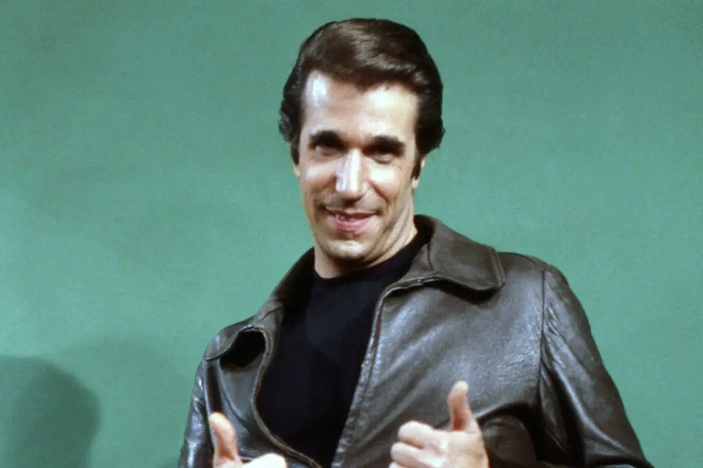
You probably remember Fonzie tapping the mirror in Happy Days and declaring himself “cool” without ever needing to actually fix his hair. That mirror gag was more than just a joke. It became a visual representation of Fonzie’s self-assurance. He didn’t need to look to know he looked good—confidence was his real grooming tool.
But on a deeper level, it also poked fun at the idea of image itself. Fonzie’s whole persona was based on being tough and slick, but the mirror moment told us he was also aware of the act. It was a wink to the audience, a quiet “I know what you think I am.” The mirror didn’t just reflect him—it reflected how he saw himself, and how he wanted others to see him. That’s a pretty deep meaning hidden in a bathroom.
7. The Empty Picture Frame in Friends
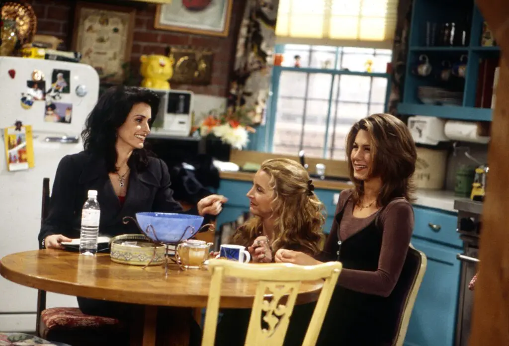
If you’ve ever looked closely at Monica’s apartment door in Friends, you might’ve noticed the picture frame around the peephole. But did you know it was originally meant to hold a mirror? It broke before filming and someone just stuck it on the door anyway. The directors liked the look so much, they left it—and it became iconic.
But symbolically, it worked better as a frame than a mirror. Instead of seeing yourself, you were seeing into the characters’ lives. The frame around the peephole became a visual portal into the heart of the show—Monica’s apartment was where everything happened. From holiday parties to tearful confessions, that doorway framed it all. Pretty fitting for a show about a chosen family.
8. The Clock in Mork & Mindy
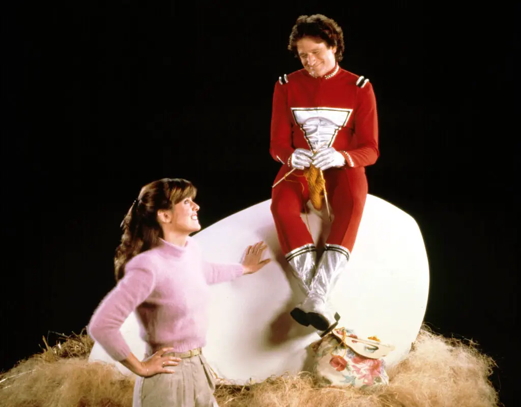
Mork & Mindy was strange and delightful, much like its lead character. But one thing that never seemed to make sense was the backwards clock in Mindy’s apartment. That was no production error—it was a subtle reminder of Mork’s alien perspective. From his point of view, everything on Earth was reversed or upside down.
It was also a clever visual cue for viewers that nothing in this world operated like the real one. Even something as routine as time was skewed when Mork was around. The clock reinforced the show’s themes without a word. It became a background symbol of how this bizarre friendship functioned in a world that didn’t quite make sense. And now you’ll never unsee it.
9. Hawkeye’s Hawaiian Shirt in M*A*S*H
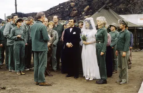
Hawkeye Pierce had a signature look, and part of it was that rumpled Hawaiian shirt. But it wasn’t just a fashion statement. The shirt symbolized escapism—it was his way of pretending he was anywhere but a Korean War field hospital. It was the opposite of a uniform, a silent protest against the violence and death surrounding him.
That shirt also reminded us that Hawkeye was a civilian at heart. Every time he wore it, we were being told, “This guy doesn’t belong here.” The bright, tropical print was completely out of place in the cold, sterile world of war medicine. That contrast made it a visual cry for peace in a setting of constant chaos. Not just a shirt, but a statement.
10. Jeannie’s Bottle in I Dream of Jeannie
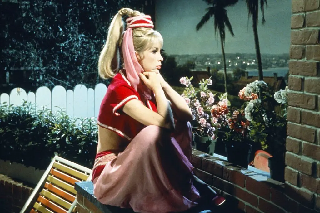
Jeannie’s ornate bottle in I Dream of Jeannie was more than just her magical home. The design of the bottle—a converted Jim Beam decanter, by the way—was rich with Middle Eastern influence. But it also had visual nods to female confinement. The narrow neck and sealed top were metaphors for how Jeannie, and women in general during that era, were often trapped or restricted.
Inside the bottle was always cozy, plush, and pink—ultra feminine and always tidy. That contrast with the outside world mirrored the tension between Jeannie’s independence and her role as a “servant” to her master. The bottle was both a sanctuary and a prison. It told a story that was far more layered than the giggles and magic might have suggested.
11. The Lamp in The Mary Tyler Moore Show
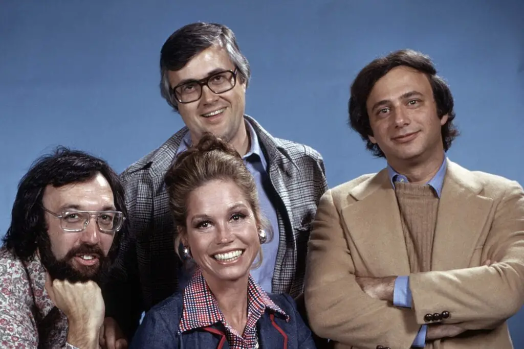
Mary Richards’ apartment lamp was a funky, modern piece that often sat behind her sofa. It looked like a stylistic choice, but it had a deeper meaning. The unique, almost sculptural design symbolized Mary’s break from traditional female roles. Her apartment was filled with trendy items that showed she was part of a new generation of independent women.
The lamp stood tall in many important scenes, quietly reinforcing the idea that Mary was shedding old norms. It wasn’t flowery or ornate—it was angular and bold, like her choices. Its placement meant it often loomed in the background of serious conversations, a modern beacon watching over her journey. Most of us never gave it a second glance, but it was always part of her story.
12. The Toy Chest in Full House
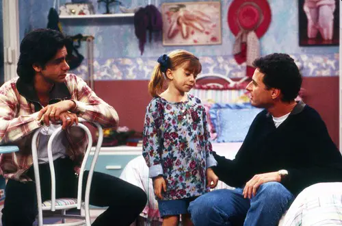
In Full House, the Tanner girls had a toy chest that showed up in a lot of bedroom scenes. It always seemed overflowing with stuffed animals and dolls, but it was more than just a storage spot. The chest was placed right next to the bed to symbolize childhood innocence being close at hand. It was always open, suggesting that the girls’ imaginations and sense of play were never shut away.
The chest also visually balanced the room between nostalgia and growing up. As the girls aged, the toys inside subtly changed—but the chest remained. It was a quiet anchor through all the transitions. Like the family itself, it adapted to change while staying fundamentally comforting and familiar. A little piece of continuity in a house full of chaos.